Nick Kyrgios.
Branding.
SCROLL
Nick Kyrgios.
Project Type
Brand Development.
Produced by
Alan Crowne @ Tonic
Disciplines
- Concept Development
- Creative Direction
- Art Direction
- Design
It’s safe to say Nick Kyrios has built an interesting reputation in the world of sport. His actions on court have branded him the bad boy of Australian Tennis, so when he approached us to refresh his personal brand and to help with the launch of his new charity the NK Foundation, we had an interesting brief on our hands.
Our task was to find a direction that was flexible enough to work for his sporting persona and also align to the Foundation created to give underprivileged kids access to sports and support. It was important for us to get a real understanding of Nick, what makes him tick and his reasons for setting up the Foundation.
We knew that updating someone’s brand on paper doesn’t mean they change how they act or perform. Instead we wanted to play to what Nick is famous for and use that to our advantage. After watching and reading many interviews and articles we discovered a guy that speaks his mind and wears his emotions on his sleeve, but who truly cares about giving others a chance of something better. It was in his passion that we found a common ground that could work across both his personal brand and the tone for the Foundation.
Through this process we discovered Nick’s love for Basketball (which rivals his love for tennis) leading us to developing a brand mark that highlights both sides of his sporting personality. This complemented his aim to give kids a proper chance of experiencing a wide range of sports through the facilities available at the NK Foundation.
Solution
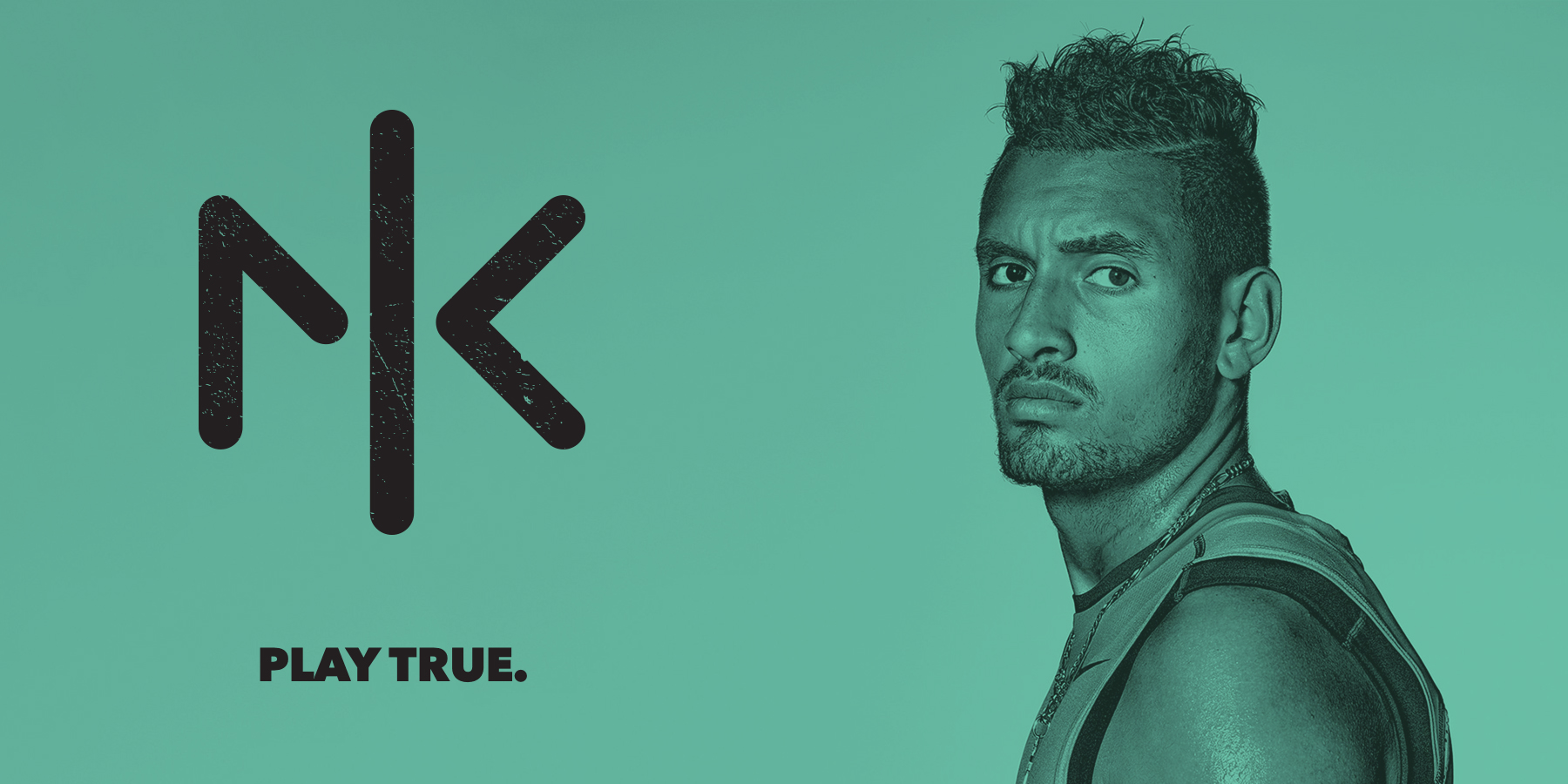
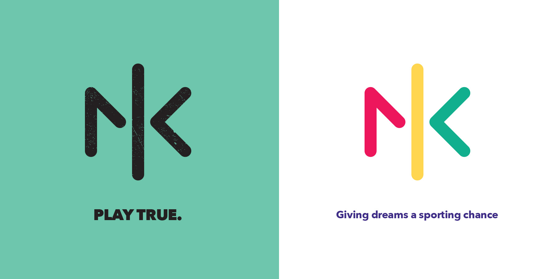
We created a brand mark that took influence from both the world of Tennis and Basketball. The shapes form ‘NK’ but are stylised to look like the lines of a basketball in one case and an overhead view of a tennis court in another. The centre line represents a tennis net with the shapes that form the N and K looking like tennis balls bouncing off it.
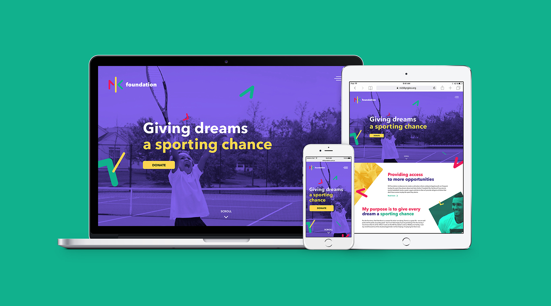
From here we developed a typography treatment and colour palette that allowed us to extend the logo mark across both brands and give the NK Foundation a more playful visual style.
We established the positioning line: ‘Play True.’ which talks to Nick’s honesty and passion when on court and to speaking his mind about what matters to him and his love of sport on the sidelines.
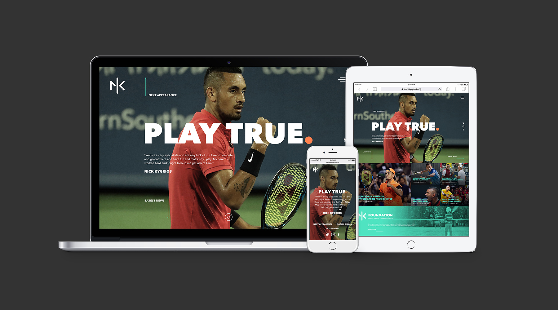
Websites were designed and developed for both his personal profile and the Foundation, each providing a range of information including a live feed to upcoming events, social media content, articles, merchandise and imagery.
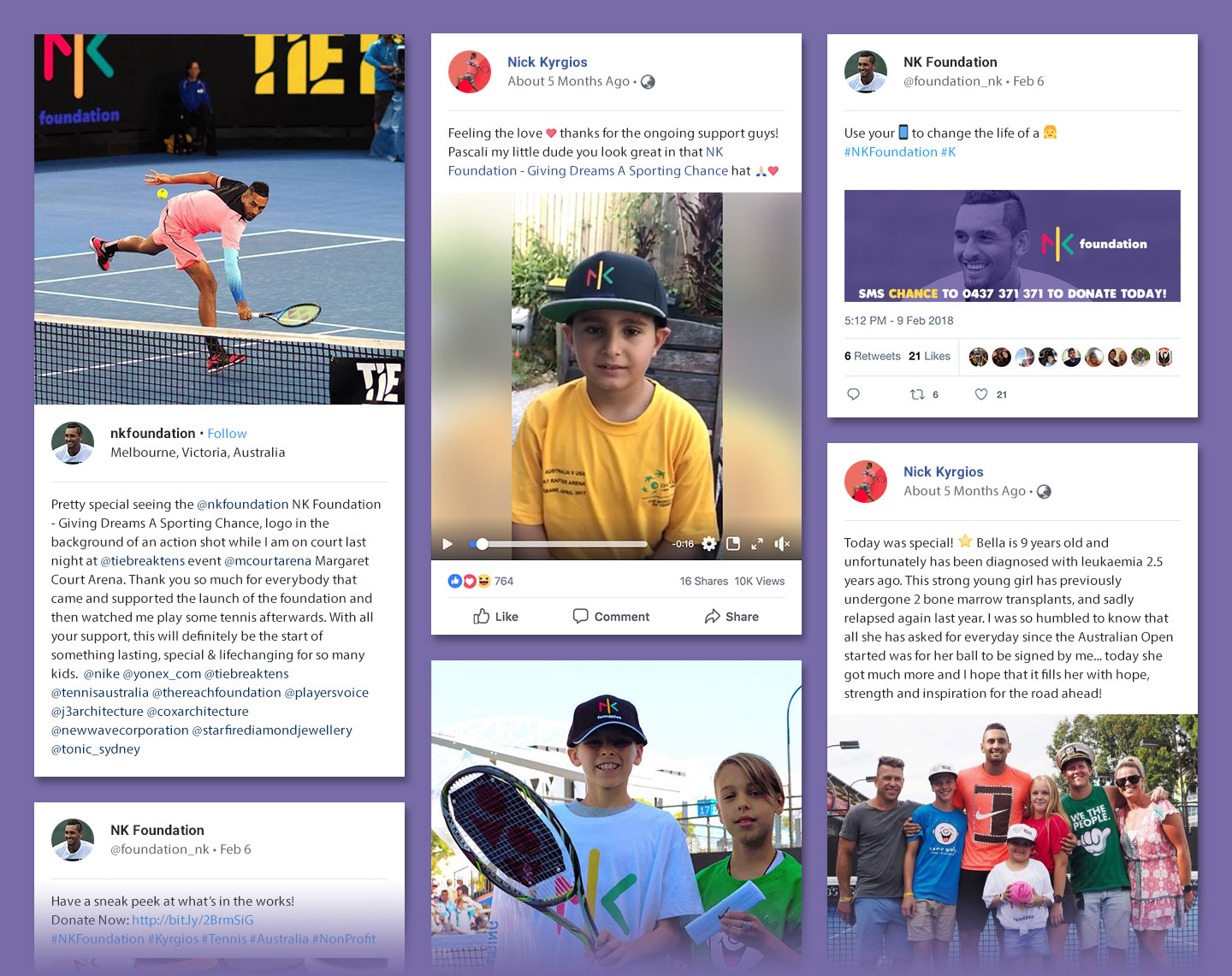
Extending the brand further we created a range of merchandise including t-shirts and caps that are now available from the NK Foundation website.